
“Superdiversity” refers to how assigned categories of racial difference and national origin have become much more complex. Highlighting these multiple layers of diversity was the goal of an international team of researchers. Steven Vertovec (Max Planck Institute) and Daniel Hiebert (University of British Columbia) built on their work on superdiversity from other cities and teamed up with City University of New York Graduate Center scholars Philip Kasinitz, Van Tran, and Kasey Zapatka to incorporate data on the New York City metropolitan area into a new set of visualization tools that they had previously applied to Vancouver, Sydney, and Aukland. Drawing on multiple data sources, the team has created an online resource to help those interested in gaining a better understanding of the spatial complexity of their communities.
The term “superdiversity” was originally coined by Vertovec to refer to the growing socio-economic diversity among immigrant groups in the UK, which were increasingly coming from a greater number of different countries than before. In the US context, this can also be applied to racial and other kinds of diversity. As a term, superdiversity is a broad concept that can reflect a variety of distinct social processes. Superdiverse communities may be experiencing social mobility, selective migration, assimilation, integration, segregation, stratification, and other processes. It is appropriate then that Vertovec proposes superdiversity as a “summary term,” since “whatever we choose to call it, there is much to be gained by a multidimensional perspective on diversity … [and] the coalescence of factors which condition people’s lives.” Thus, superdiversity serves primarily as an indicator that some underlying social process is occurring. Moreover, a question remains of whether the diversity of immigrants or racialized groups is actually growing, or whether superdiversity is primarily a product of the increasingly refined data that is available. The ability to identify superdiversity could nevertheless be useful for scholars and policymakers concerned with changes in urban areas.
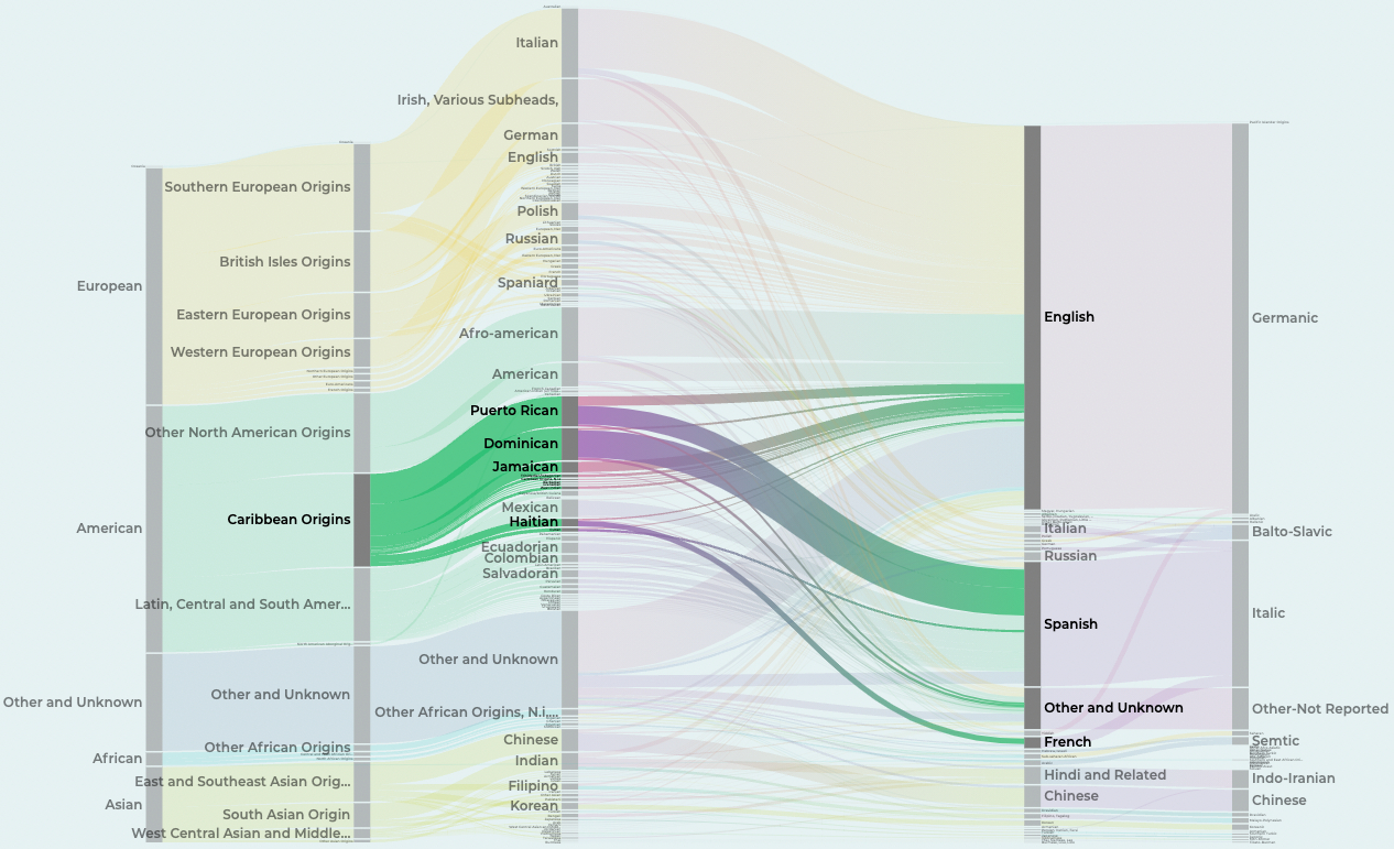
This new visualization tool draws on immigration data from Department of Homeland Security (DHS) and socioeconomic data from the US Census bureau to help us see trends and patterns in superdiversity in New York City and at the national level. For those interested in the superdiversity of the New York City area, the tool shows a variety of socio-economic variables, like employment status, educational attainment, income, and homeownership status, across racial groups. For national immigration trends, users can interactively examine over time the country of origin for immigrants, as well as their native language and visa type, to better understand permanent and temporary immigration flows.
Among the useful visualizations are interactive graphs on migration patterns, which simultaneously show the national origin of new migrants to the New York region, while also indicating whether people moved as students, temporary workers, diplomats, or others. This, for example, allows us to see that in 2018, while most temporary workers to New York came from Asia and the Americas, particularly India, Canada, and Mexico, most diplomatic migrants came from Europe.

The tool also documents language diversity by showing the connections between the mother tongue of the population of New York immigrants with their country of origin, demonstrated with a Sankey diagram. This is particularly useful in a city that is trying to expand its multilingual accessibility tools.
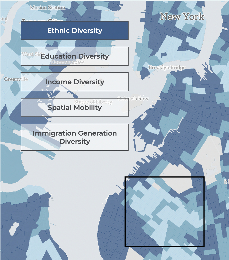
One of the team’s main creations is the ability to map dimensions of “diversity” interactively, visualizing them in combination with one another. These “superdiversity maps” go beyond “traditional maps” (which show only one distribution at a time, such as percent high income, percent immigrant, percent white, etc.) in two ways. First, they provide measures of “diversity,” which statistically synthesize the total composition of a neighborhood with respect to ethnicity, education, income, mobility, and immigration status. Secondly, they allow the user to pick two diversity measures simultaneously. One can thus see, for example, the areas of the New York metro area that have high ethnic diversity but low income diversity.
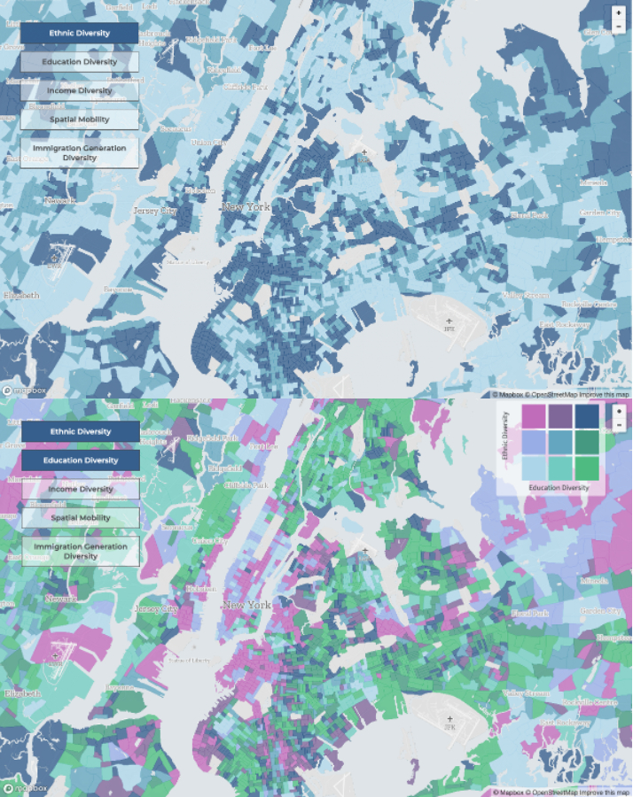
At the same time, these superdiversity maps are the most challenging visualizations on the website. What makes these maps challenging is not so much displaying two variables simultaneously, but the use of “diversity” as the measure. These kinds of measures are difficult to interpret on their own, let alone in combination with other variables, especially for those not familiar with these kinds of statistical indexes. Moreover, when seen as a map, they can make it difficult to identify specific communities of interest.
Take, for example, the area of southern Brooklyn. The ethnic diversity map shows a single cluster of low ethnic diversity below Greenwood Cemetery. The clustering leads one to think that this is a single area of a more homogeneous community.
When we look at the single race choropleth maps, however, we see that these are actually two separate communities—Borough Park and Sunset Park—with large white and Asian communities, respectively.
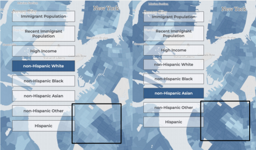
This example reflects a few issues. Choropleth maps like this are useful in identifying areas of concentration, or hot spots. The human eye groups things of a similar color together, leading us to think that everything there is related—especially when the geographical subunits are small like Census tracts. This becomes more complicated when we use an index measure like “diversity,” in which areas of “high diversity” could reflect very different underlying compositions. The same color on a map may in fact represent a wide variety of constellations of variables. For those interested in simpler maps, an option could be added to create the same kinds of two variable maps, but using more conventional measures like “percent Black,” “median income,” or “percent with college degree.”
Overall, the tool is fairly simple to use by pointing and clicking, making it easy for people who just want to see the information. For those wanting to play with the data on their own there is not yet a way to download the tabulated data. The visualizations are mostly intuitive and presented in a way that reveal patterns and trends you would not be able to see as easily otherwise.
One challenge with the amount of data we have at our fingertips today is how to distill it into a clear story. This is important for researchers, policymakers, and interested community members. “Superdiversity” seeks to capture the complexity of the world. Users will thus have to figure out on their own how to take complex data and turn it into a coherent story. This tool will not do that for them, but it is easy enough to use to get people started on answering complex questions in a constantly changing city.


